
Lessons from working with analysts who tracked too much or too little
In my last post, I talked about those vague requests we often get as Power BI developers, the ones where stakeholders don’t really know what they want. We covered how to dig deeper, ask better questions, and gradually frame the right report. But even when we’ve got the big picture clear, there’s one thing that can quietly make or break a dashboard: the choice of KPIs.
And trust me, I’ve seen it all, from dashboards jammed with dozens of indicators (because “we might need them”) to ones with only a sales total and nothing else to guide interpretation.
More Isn’t Better
A few years back, I was building an executive dashboard for a commercial real estate company in New York. The brief was to show “everything that matters” about the deal pipeline. I worked with a team of analysts who were incredibly sharp, but also had a tendency to over-track. We ended up with a spreadsheet of nearly 40 metrics they thought were important.
Here are just a few:
- Number of active deals
- Average deal size
- Median deal size
- Pipeline value by stage
- Conversion rate by source
- Lead volume, by source, by broker, by week…
It went on and on. The problem wasn’t that these KPIs were wrong. It’s that not all of them told a meaningful story, at least not at the executive level. We needed to surface the right questions first, then let the metrics support the thinking, not replace it.
Start With the Goal, Not the Metric
So, I paused the build and asked a few pointed questions:
- What decisions are being made based on this dashboard?
- Who’s looking at this regularly?
- What behaviour are you trying to encourage or track?
- If something changes in one of these metrics, what happens next?
What came out of those conversations completely reshaped the design. We stopped thinking in terms of what we could show, and started focusing on what we should show.
Here’s the shift we made.
| Original Approach | Refined KPI Thinking |
|---|---|
| Track every metric “just in case” | Highlight key metrics that trigger specific action |
| Equal visual weight for all | Emphasise KPIs with direct impact on performance |
| Focus on volume metrics | Include efficiency and conversion insights |
| Historical views only | Add current vs target indicators |
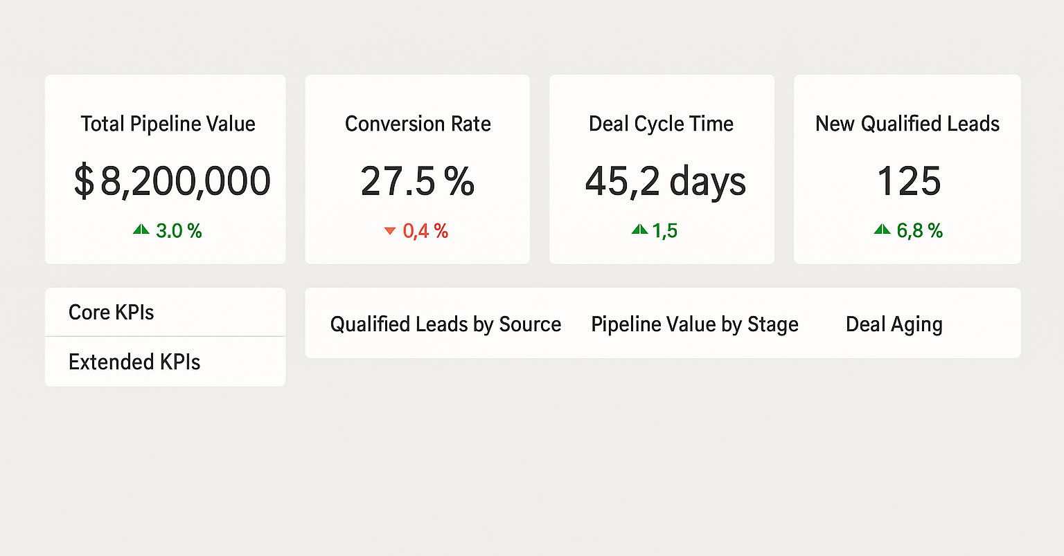
Core vs Extended KPIs
I like to think of KPIs in layers, something I apply often in Power BI.
- Core KPIs are high-level, outcome-focused metrics that should live on the front page. These might be:
- Total Pipeline Value (vs target)
- Conversion Rate
- Average Deal Cycle Time
- Number of New Qualified Leads
- Extended KPIs are your drill-downs or tooltips. They help explain why a core KPI has changed, but don’t need to be front and centre.
By separating these layers, you help your users focus without overwhelming them. It also opens the door for interactivity. In Power BI, slicers and drill-through pages are a perfect way to let curious users explore deeper without cluttering the main view.
A Real-World Example: The “Stuck Deal” Problem
In one case, I noticed that although the total pipeline value looked good, deals were sitting too long in the “Fee Agreement” stage. This wasn’t visible in the original dashboard.
We added a Deal Ageing KPI and colour-coded cards to flag deals stuck over a certain threshold. Then we gave users the ability to click through and see which deals were affected, who owned them, and what stage they were in.
This small change sparked real action: deal review meetings started focusing not just on volume but on movement. Suddenly, ageing deals were getting attention, and conversion rates improved without increasing lead volume.
Tip: KPIs Need Context
A KPI on its own doesn’t mean much. Saying “Conversion Rate = 7%” isn’t helpful unless we know:
- What’s normal?
- What’s the target?
- Is it trending up or down?
- How do we explain the change?
That’s why I always recommend using variance indicators, targets, and time comparisons in KPI visuals, not just raw numbers.
Common Traps to Avoid
Here are a few mistakes I’ve seen (and made) over the years:
- Tracking too much: If nobody acts on it, it’s not a KPI. It’s a distraction.
- Focusing only on inputs: Number of meetings or leads is fine, but what matters is what they lead to.
- Over-relying on templates: KPIs must fit the business context. A SaaS-style dashboard won’t help a CRE team closing 12-month deals.
Final Thoughts
Defining KPIs isn’t just about picking numbers that look good on a dashboard. It’s about finding the signals that drive behaviour, and designing your report to highlight those signals clearly, consistently, and with just the right level of detail.
In the next post, I’ll talk more about designing for attention, how layout, colour, and interactions help highlight the right metrics without overwhelming the user.
Until then, think about your reports: are you showing what really matters?