
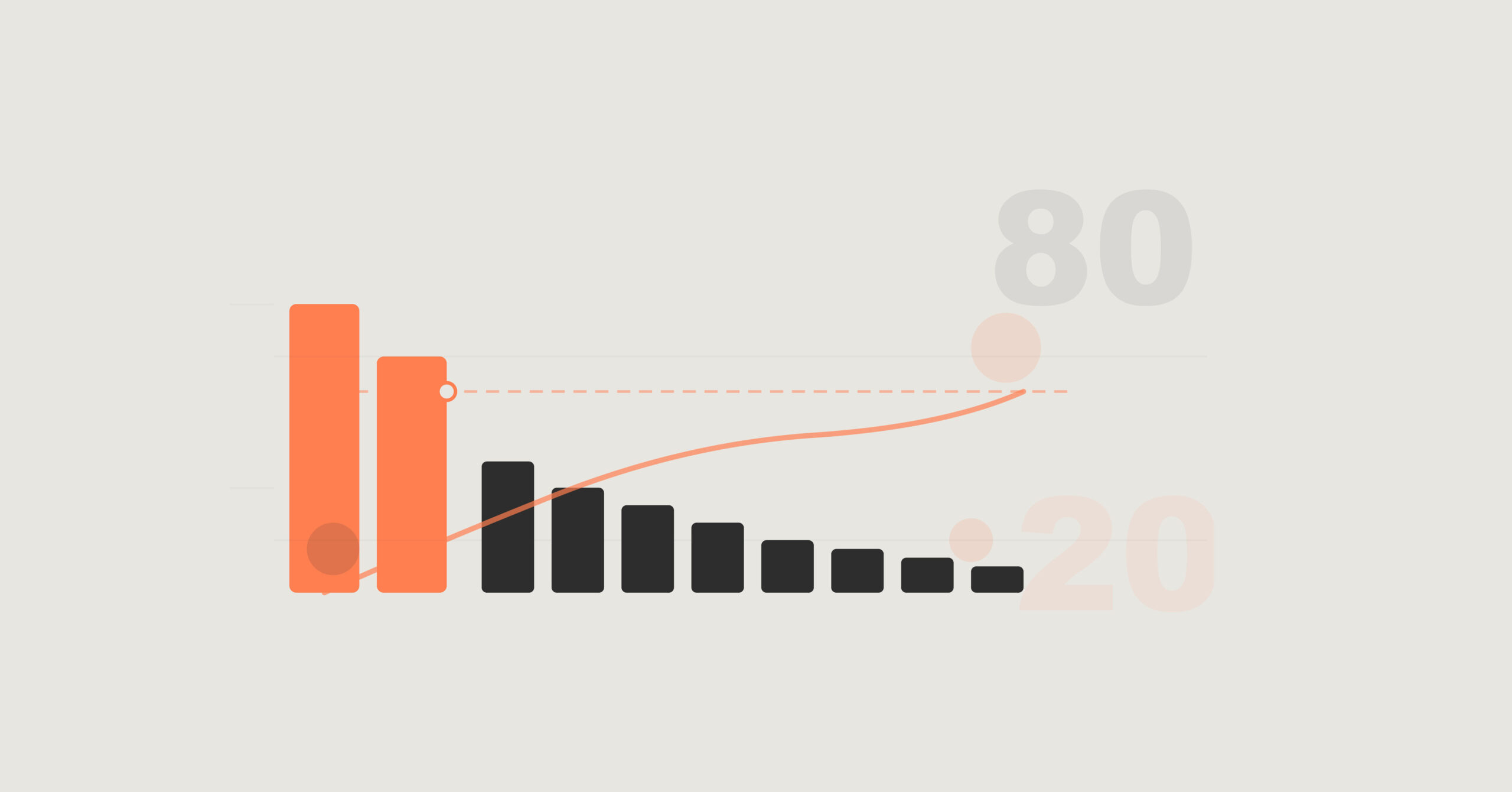
You’ve probably heard of the 80/20 rule, haven’t you? That fascinating principle that tells us roughly 80% of our results come from just 20% of our efforts. It’s one of those business concepts that sounds simple in theory but can be absolutely transformative when you actually apply it to your data.
I’ve just published a comprehensive video tutorial that walks you through exactly how to implement Pareto Analysis in Power BI using DAX. And I mean really walks you through it – no skipping steps, no assumptions about what you already know, just clear, practical guidance from start to finish.
What You’ll Learn
In this tutorial, we’re working with the Adventure Works database (Microsoft’s sample dataset that’s brilliant for learning). The goal is straightforward: identify which products are responsible for the majority of your internet sales revenue.
But here’s the thing – we’re not just creating a static report. We’re building a fully dynamic solution that responds to slicers, adapts to filters, and works across different contexts. The kind of analysis that actually proves useful in the real world.
I’ll show you how to:
- Rank products based on sales performance
- Calculate cumulative sales as you move down the list
- Work out cumulative percentages
- Identify which products contribute to that crucial top 80%
More importantly, I explain the why behind every DAX formula. Not just what to type, but why we’re using RANKX instead of RANK, why ALLSELECTED matters, and how SUMX creates that running total effect.
Why This Matters
When you can visualise the Pareto Principle in your Power BI reports, you gain clarity on where to focus your energy. Which products deserve more marketing investment? Which customers should your sales team prioritise? Where should you allocate resources for maximum impact?
It’s about separating the “vital few” from the “trivial many” – and doing it in a way that’s visual, interactive, and genuinely insightful.
Who’s This For?
Whether you’re relatively new to Power BI or you’ve been using it for a while and want to level up your DAX skills, this tutorial breaks everything down in plain English. I’ve deliberately kept it conversational and beginner-friendly, but we’re building something sophisticated.
The techniques you’ll learn aren’t just applicable to product analysis either. You can adapt this approach to analyse customers, regions, salespeople, or any other dimension where you want to identify top performers.
Ready to Dive In?
The video runs about 17 minutes, and honestly, by the end of it, you’ll have a powerful analytical tool that you can immediately apply to your own Power BI reports.
[Insert YouTube Video Link Here]
If you find this helpful and want to explore more advanced DAX techniques with real business context, I’ve written a book that’s packed with practical examples just like this one. You can find it on Amazon (link in the video description).
Right, I’ll let you get to it. Watch the video, build the analysis, and let me know how you get on. Drop a comment on the video if you have questions – I love hearing from you and helping you solve real problems.
Happy analysing!
P.S. – If you’re enjoying these tutorials, subscribe to my YouTube channel. I publish regular Power BI tips, tricks, and real-world business scenarios that you can actually use in your work.